Having filled its adverts with sponsored statuses, LinkedIn has now developed a statistics tool with more features. What information should be analysed and how should it be used? Read this article and find out!
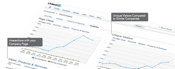
This new statistics tool offers a wealth of different options for companies interested in developing their social strategy on this particular network. They can use it to analyse the impact of each publication, single out trends, gain a better understanding of their audiences and keep an eye on their competitors. Here are a few explanations that will help you understand and use these new statistics more effectively.
Analyse the impact of your LinkedIn publications
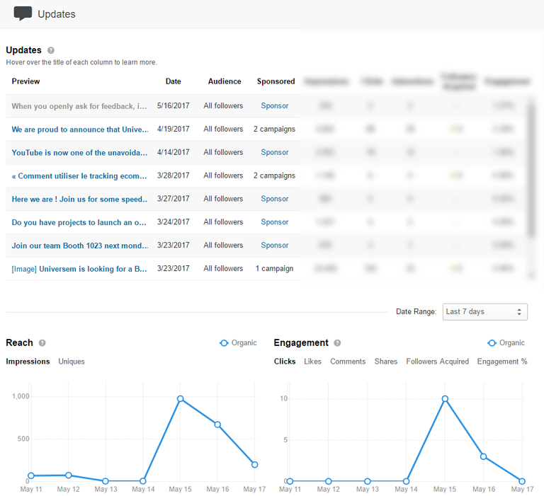
When you click on the “Analytics” tab, you get a summary of your most recent posts. You can then compare them all – irrespective of whether they are sponsored – (see our article on sponsored statuses) and find out which ones have generated the best results.
These results can be expressed in a number of different ways:
Impressions
The impressions column shows the number of times that your news item has been seen by LinkedIn members. This figure is a very useful indicator in raising visibility when the number of people reached is more important than the action taken.
Clicks
This tool tells you the number of clicks that your content has generated. It also includes clicks on the company name or its logo. This data is particularly useful if you want to get your target to perform a specific action (visit the website, browse a job offer, register for an event, etc.).
Interactions
The interactions column shows the number of times that people have liked, commented on or shared your publication. Try to insert an attention-grabbing title, together with a link or an image in order to get the discussion going.
Also, each time a member likes, shares or comments on your post, it will appear in their contacts’ newsfeeds. This is a useful and easy way of reaching people outside your network “for free”.
Followers acquired
You can also see how many followers each publication has generated for you. This information is only available for sponsored news items – the others are only visible to people who already subscribe to your page.
Percentage of interactions
The last column gives the percentage of interactions that have occurred. This figure is obtained by dividing the number of interactions, clicks or followers by the number of impressions. The result is that you get a more reliable indicator, because it is proportional to the number of impressions.
At the bottom of this table, you’ll find two graphics which use these various pieces of information to highlight engagement trends. Publications can be filtered by period and by type of interaction.
Get detailed demographics data about your followers
In addition to analyzing the performance of each publication, the new tool also provides you with invaluable information about your followers. You can get information about their seniority, their business sector, the size of the company they work for, their job function and the percentage of employees relative to non-employees (see image below).
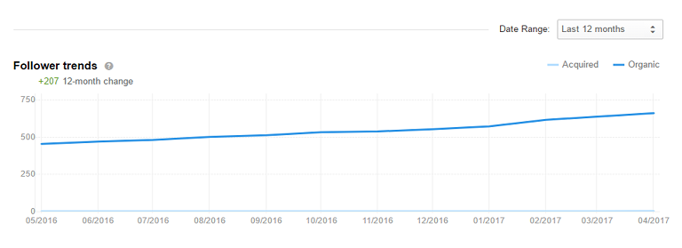
Using the graphic showing followers trends, you can also track follower acquisition for different periods (in the example below, over the last 12 months).
You can use this data to find out more about your audience and adapt your publications accordingly, as well as create a typical profile of the kind of person interested in your business. You can also better target your adverts and make predictions about how they will perform.
Compare your audience to that of your competitors
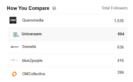
The tool can also provide you with a brief comparison of your page and those of your competitors based on the number of followers. Are you at the bottom of the list? Don’t worry – just have a look at what your competitors with the most followers are doing and find out what lessons you can learn.
Or feel free to get in touch with us. Our experts can help you refine your social strategy so as to raise your profile on the network… and therefore increase your audience.

